Architecture that Resonates
EQ. delves into Andrew Kikoski’s creative process and gets a behind the scenes look at his work on Hudson Yards
INTERVIEWED BY DANIEL HILPERT
DH: You and I had an opportunity to get to know each other better through 2 West Water in Sag Harbor. My firm financed the project and you’re the architect. As you know, the prior developer had failed for years to secure approvals, but your firm made the process look effortless. What’s your secret?
AK: We set out to create architecture that deeply resonates with this special village and wanted to make buildings that would truly stand the test of time. So, before we started, we looked at the physical characteristics of the village and took inspiration from its architectural language. By investigating the context, and distilling its essence, we created a design that responds to and amplifies the very core of Sag Harbor. Our process delivered unanimous approval for the project from the Architectural Review Board in just five months—a testament to the careful analysis that we undertook to embrace the language, materiality and spatiality of this context and its community.
DH: What other work have you done in the Hamptons? I’ve also heard of your Hamptons Prototype house. Tell me more about it.
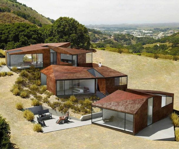
AK: We designed 97 Mid Ocean Drive, a spectacular 10,000 sq. ft. oceanfront house, to create harmony among house, land and sea. It’s a contemporary design that brings the outdoors in by dissolving the boundaries between interior and exterior living spaces with structural sliding glass walls. The massive outdoor deck, poised above the dunes, provides a focal point for casual summer living with a glass-edged pool, trellised kitchen, dining area, seated fire pit and multiple areas landscaped with native plantings. Notably, our design embraces the most advanced sustainable technologies in climate-conscious building including geothermal ground coupling and a solar rooftop panel farm. Even the playfully proportioned facades incorporate high-tech glazing to minimize solar heat gain.
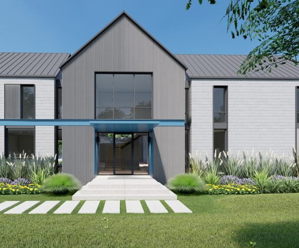
Our Hamptons Prototype is a 3,000 sq. ft. house that is shockingly affordable to build and offers an effortless indoor/outdoor lifestyle. Inspired by the farm buildings of Long Island’s East End, we developed two different options each featuring an expansive gabled great room, luxurious master suite, three additional bedrooms including a second junior master suite and a fully finished basement to create a gracious home that can be tailored to a variety of tastes and different one to two-acre Hamptons building sites.
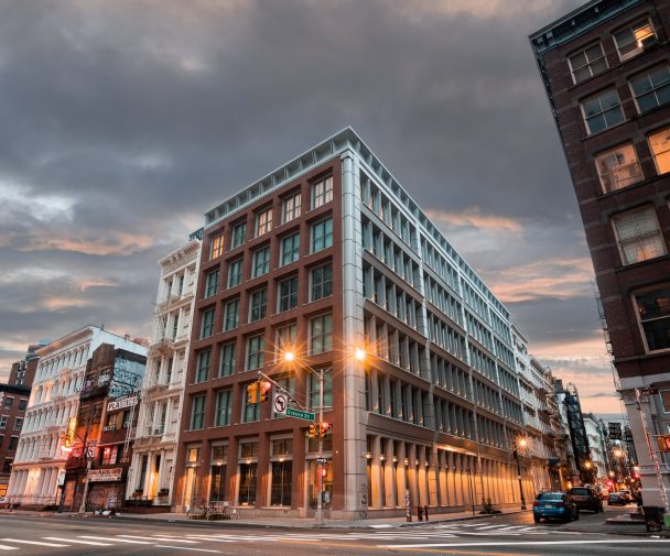
DH: Let’s talk about your NYC commissions and work. In this issue of EQ we’re writing about 75 Kenmare in Nolita, which you designed. I think with this project you have truly demonstrated versatility and creativity both in terms of design language and understanding of materials and execution in the field. Tell me more about the genesis behind this project and the amazing façade.
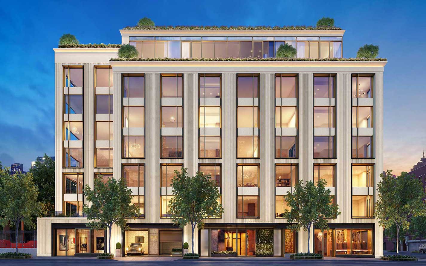
AK: We sought to make a striking contemporary statement to complement Nolita’s rich architectural fabric with a landmark façade that is integrated, layered and offers a cohesive experience of architecture and its context. We studied ways in which hand-laid brick is used to create detail and expression in historic buildings around Nolita, as well as ways that masonry brings pattern, texture and rhythm to this and five adjacent neighborhoods. The result is an innovative design solution that embraces the historic character of the neighborhood yet feels contemporary. The concrete features three narrow channels at 1-1/2”, 2” and 2-1/2” wide, each rising 65 feet above the street. With each channel set in its own plane, and randomly staggered with respect to the other two, the facade offers a contemporary composition of color and patina that is animated by a play of shade and shadow in this richly visual and finely tuned work of architecture. Perched at the convergence of SoHo, NoHo, the Lower East Side, Little Italy and Chinatown, our design creates an architectural connection to these five intersecting neighborhoods and a true sense of place in the city.
DH: The NYC condo market is very competitive. How will your design be perceived by the market and translate into sales?
AK: Given the initial feedback, I believe there’s been an incredible response to 75 Kenmare’s distinctive architecture that will help the building outperform all others in its competitive subset.
DH: I follow your LinkedIn posts. You travel a lot. How does your travel influence your work and what do you bring back to your clients?
AK: I love travel and find it abundantly inspiring to visit new places and feed my endless curiosity about the world. These sights, sounds, smells and tastes are fundamental to the innovation and fresh perspective we bring to our client collaborations, especially those who are inspired to integrate art and architecture with innovative craftsmanship. For instance, One Hudson Yards benefits from the vibrant new sense of design I experienced in Stockholm, whereas my recent trip to Singapore influences how we think about combining buildings with landscape.
DH: If you had carte blanche, what would your next design project be?
AK: We have been so fortunate to design everything from high-rise towers to houses and every aspect of their facades and interiors—including materials, furniture and even wallcoverings and faucets—and have won international awards in every category. Right now, I think it is pressing to tackle projects that more aggressively deal with some of the major problems we face such as climate change. We are about to start work on a passive house on the remote coast on Maine, and we are excited about that. I’d also love to design a car.
DH: Next time, I want to hear more about that. Let’s switch gears and go to your work on Hudson Yards. You told me that Related’s prime focus was to create condo-level finishes in a rental building and showcase a timeless design. Tell me more about your strategy and what it was like working with Related.
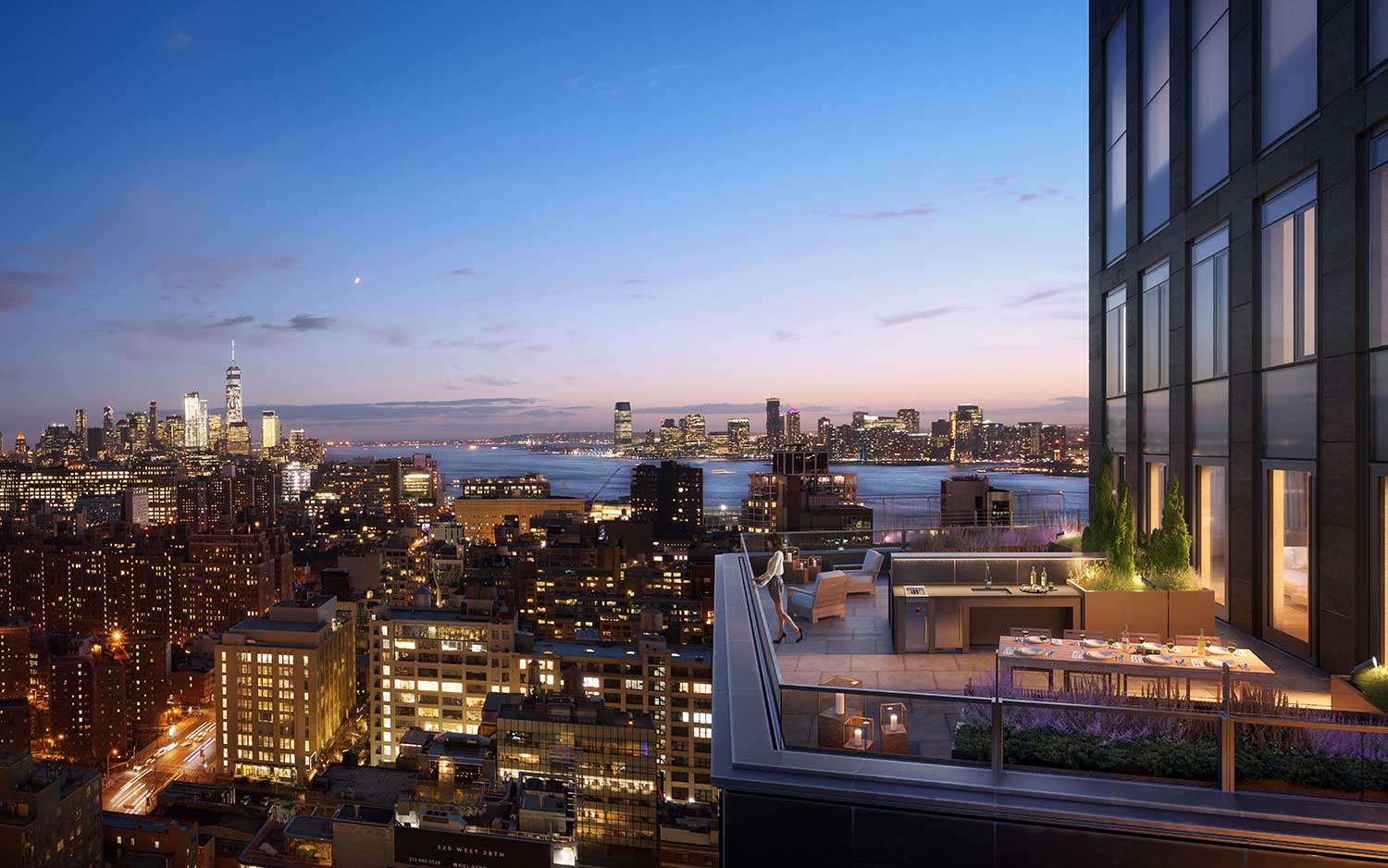
AK: One Hudson Yards is unique in that Related gave us total creative freedom to design an ultra-luxury residential environment; not just apartment interiors, but a full 26,000 sq. ft. suite of incredible amenities that will be the apogee of lifestyle-driven experiences. We imagined an engaging and extraordinary spatial sequence where every detail is considered. We worked with craftsmen and artisans all over the world to produce new materials, envisioning something truly special and sophisticated at every moment and scale. To us, luxury is emotional, not transactional, and we sought to create a tailored environment for the exceptional individuals who will reside in this building.
Our design references the surrounding neighborhood of Hudson Yards, defined by the organic quality of the High Line and the contemporary geometries of its new architecture. These intrinsic characteristics shaped our sensibility and our vision for a sophisticated design expression.
DH: I understand that there is art in the building that has been specially curated to fit the space; is this true?
AK: Art has always been central to our practice, as we integrate art and architecture seamlessly in our work. We sought to present the ideas that define our design through the building’s art collection. All 11 pieces in the building are about process, production and are driven by their materiality. Effectively they underscore the process and craft that are at the core of our work at One Hudson Yards. Ultimately, the art and architecture dissolve into each other, creating a truly one-o- a-kind residential experience.
DH: Tell me about the design of the One Hudson Yards lobby.
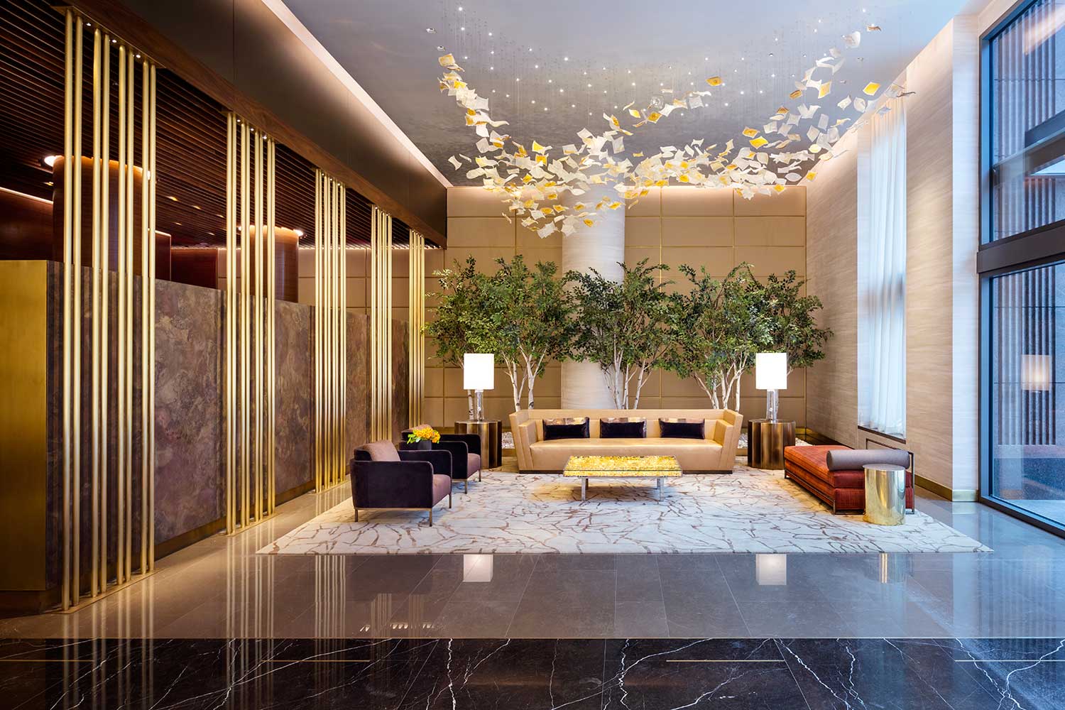
AK: As the threshold to this super-sensory experience of luxury, the lobby realizes an all-encompassing visualization of our ideas and themes. The design started with a challenge from Related to debut never before seen materials that convey sophisticated, contemporary grandeur. Working with a fine art foundry—which fabricates sculptures for iconic artists such as Alexander Calder, Anish Kapoor and Roy Lichtenstein among others—we created a 25-foot-long feature wall of cast bronze panels. Molten bronze is poured over natural linen fabric; as the loosely gathered linen vaporizes, the process imparts the toothy texture of the fabric in a rich organic pallet of cognac, coffee, port, chocolate and shimmering gold tones that evoke the animated presence of Rothko’s famed chapel paintings. This stunning material is complemented with huge backlit planes of richly veined translucent slabs of Brazilian Oro Cristallo Quartzite, creating a play of motion and texture across both materials.
The colors and movement of these two materials inform every aspect of the design of the Lobby. The palette from the bronze and Oro Cristallo is engaged to render more understated elements, such as elegant stone floors inset with bronze, American walnut millwork and leather upholstered walls. The colors and material indexes also reappear in a rich and sophisticated array of fabrics covering the furniture including custom designed pieces which we and others designed.
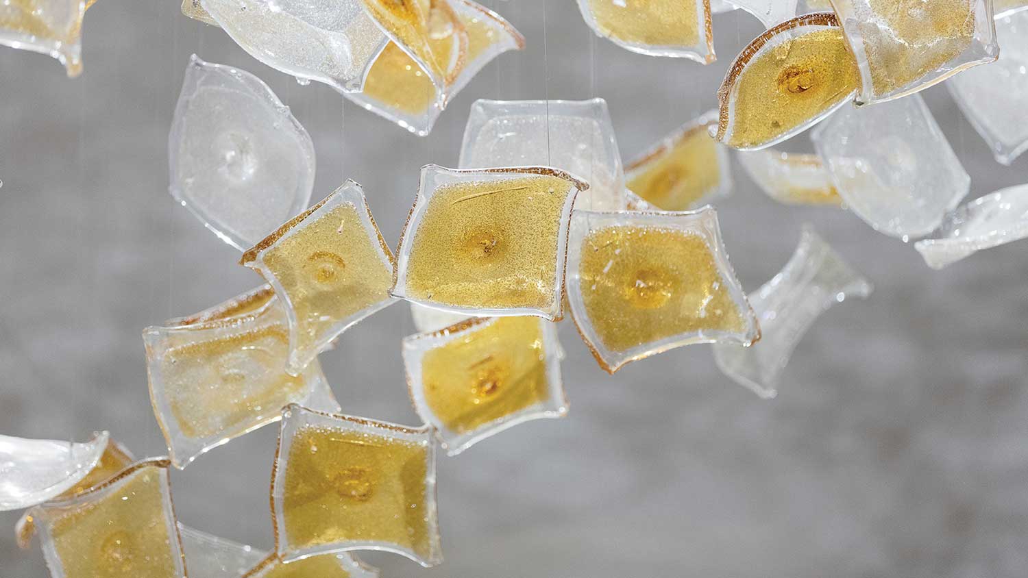
And of course, there is art. Behind the concierge hangs an exquisite piece by Michel Francois, Instant Gratification, which is made at the same foundry as the bronze wall panels. Scribble, a playful sculpture also by Francois, occupies a niche on axis with the front door, greeting residents as they arrive. A coffee table by the artist Yves Klein is filled with 3,000 sheets of loose gold leaf. And overhead, a bespoke chandelier comprised of almost 400 sculptural hand-blown glass pieces, from Lasvit Glass, spirals through the space, echoing the rich organic qualities and distinctive colors of the bronze panels. There are four varied types of glass in clear and amber tones, enhanced with silver and bronze mica-flakes for visual texture and to direct the refraction of light. Truly this is a magnificent place of arrival—cohesive in its geometries, themes, colors and materials—creating an emotional threshold to One Hudson Yards.
DH: And the amenities of which you spoke before?
AK: For us, amenities are truly an extension of the home and afford important opportunities for relaxation, entertainment and wellness. Executed with the same level of custom materials, artistry and craftsmanship, our amenity spaces at One Hudson Yards are unparalleled. For instance, our design for a bowling alley/game room features a Jeff Koons inspired chandelier of multi-colored stainless-steel bowling balls, a neon wall piece quoting The Big Lebowski, custom trapezoidal blue suede wall panels of varying depth, and a wall with over 2,000 stem mounted billiard balls. All accommodate two regulation lanes, foosball and pool tables, shuffle board, video arcade games and a generous kitchen and bar. There is also an athletically themed fireplace lounge, two penthouse party rooms with exterior terraces, a suite of athletic amenities including an 82-foot pool, plunge pool, salt pool and hot tub, all complimented by a spa oasis with sauna and steam room, as well as an indoor basketball court and locker rooms. All are designed to create community within this truly one-of-a-kind residential experience resulting in an emotional luxury of joy.
DH: As always, it’s a pleasure to hear you talk about your work. Thank you.
